The Art of Beer
With a sea of craft beers filling store shelves, a growing number of brewers are looking to set themselves apart by focusing on more than just what’s inside the bottle or can. They’re also making a priority to what’s on the outside.
Yes, beer labels are now often displaying works of art.
Gone are the days, where the label was a plain name displaying brewery logo and the name of beer. Today, beer label designs are meant to grab your attention before you purchase and urge you to make a second look after pouring a can or bottle.
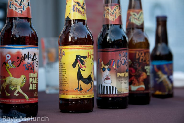
Flying Dog Brewery of Frederick, Md., which celebrates its 25th year in 2016, has some of the most eye catching labels in the industry. The brewery’s best known brews, including Raging Bitch, a double IPA, have had labels made by iconic artist Ralph Steadman, whose claim to fame was illustrating Hunter S. Thompson's articles and book covers. Steadman has worked on making Flying Dog's beers stand out with his inimitable style since 1995. He was introduced to Flying Dog's owner George Stranahan via Thompson, who were bonded through their love of Colorado and drinking beer.
The art on the beer labels is so recognizable that if all the wording on Flying Dog's bottles were erased, most fans would still have no doubt who makes it. “At its core we don’t just believe we are brewing beer. What our brewers are doing on a daily basis is to create a beer style that is in itself a work of art much like oil on canvass,” said Ben Savage, Flying Dog’s chief marketing officer. “We need to make sure the art on the outside matches the art on the inside.”
Savage said the brewery typically tells Steadman the beer name, style, ingredients and then sees what magic he comes up with. “What we get from Ralph is true art… and it is always more than we could expect.”
Steadman’s impact on the brewery has gone beyond just art. He wrote on one label for a porter-style beer: “Good Beer –No Shit.” Colorado banned the label for profanity and the brewery took the case to court where it eventually prevailed. Now, that phrase is on its bumper stickers and all types of merchandising.
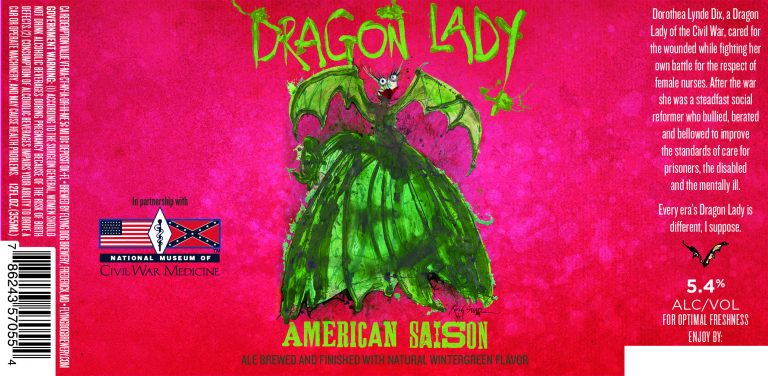
While Flying Dog has had the emphasis on unique artsy labels for many years, the special look has become increasingly important as a number of new breweries has surged in the past few years. Flying Dog’s latest beer label will hit store shelves next spring with Adult Swim, a radler and in January with Dragon Lady, a saison created in partnership with the National Museum of Civil War Medicine, also in Frederick.
Steadman, 80, who lives in London, does new two or three new beer labels a year for Flying Dog. “There is more emphasis on the ability to stand out on the shelf and with a work of art on the label, I think we have always done that,” Savage said. “Gone are the days from the 1990s where craft beer styles just meant a ribbon and a shield on the outside,” he said.
The art and graphic design of the labels and logos helps define craft breweries for their style. Savage notes Sam Adams beer is known for its patriotic themes. In Munster Indiana, 3 Floyds Brewing is known not just for its world famous Zombie Dust Beer, but increasingly for its sci-fi beer label art. The brewery’s scary looking beer labels go with beer names like Permanent Funeral and Space Station Middle Finger. The art has such shock value that it's as much a part of the 3 Floyds brand as the beer is.
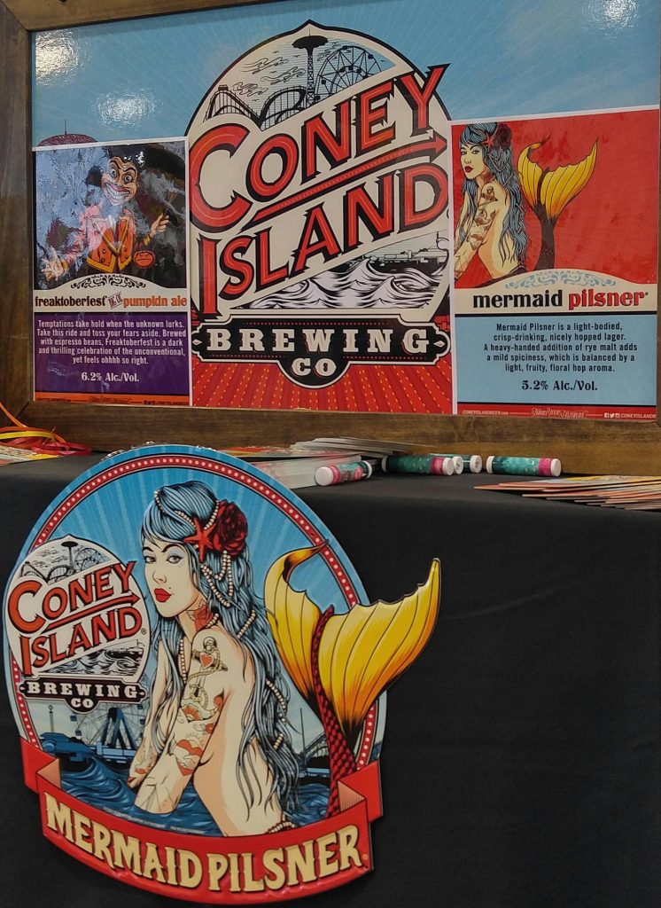
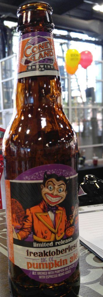
It’s not just well established breweries embracing the value of art on labels, but several newer ones too. One that caught my notice at a recent beer festival was Coney Island Brewery. In 2007, it was deemed the smallest brewery in the world by the Guinness Book of World Records. After the tiny storefront brewery was destroyed by Super Storm Sandy in 2012, the brand was sold by Alchemy & Science, the craft beer incubator owned by Boston Beer Co. which makes Sam Adams. They immediately made art a priority and reopened the brewery in 2015 in a new location in the heart of Coney Island, Brooklyn. The brewery pays homage to Coney Island, from carousel-themed wallpapers and old black and white photos of the Island. Their logo includes the famous Wonder Wheel, the Parachute Jump and the Cyclone roller coaster.
Dan Jones, art director for Alchemy & Science, said as soon as the brewery was purchased, its new owners knew they wanted to capture the beauty of Coney Island on it labels and logo. “We didn’t know the level of detail or the exact style we’d be looking for, but Coney Island is vibrant, exciting, artistic place, and we wanted to make sure we captured that. And from a more practical standpoint, we believe that the quality of packaging communicates what’s inside.”
Jones added: “Art is fundamentally a tool for expression: it helps us tell the world who we are, what we care about, how we want to be seen,” Jones said. “Hopefully, the role of the art is to draw people in to our world, to give them a point of reference for where we’re coming from when we make our beer, or to get them to stop and think, “Well that looks interesting… I’d like to know more about this place."
Perhaps its most amazing label is on its Mermaid Pilsner. It features a red haired mermaid in front of the Coney Island amusement park and famous Cyclone rollercoaster. “Its such an alluring illustration that we consistently hear great feedback on,” he said. “She’s set the benchmark for everything else.”
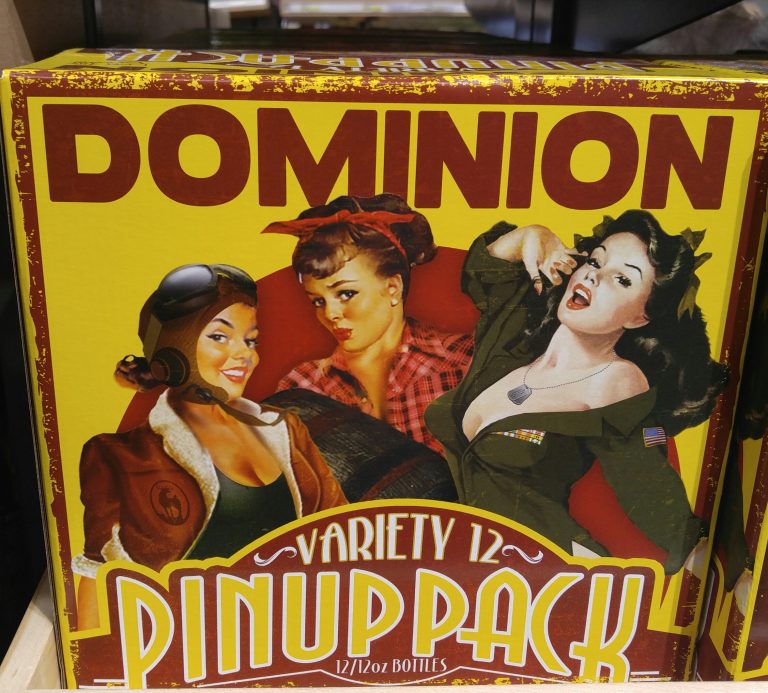
Fordham and Dominion Brewing in Dover, Delaware also pays homage to the past with its World War Two-era pinup style labels on its Dominion brand beers. The brewery is just a stone’s throw from giant Dover Air Force base so the brewery thought using art associated with the military would gain a following.
The brewery’s Double D double IPA, shows a woman aviator on the label wearing a bomber jacket and a garter sitting on top of her 1940s military plane flying through the clouds. Hop Lips IPA has a blonde nurse on the label in her white uniform standing in front of military base. Morning Glory Espresso Stout features a young brunette woman wearing a green military shirt, standing in front of a window with an army plane just outside.
“People love it and being so close to the military, people think it’s the coolest thing,” said Sarah Ottinger, events coordinator at the brewery. The pinup girls have also become big sellers on posters and t-shirts.
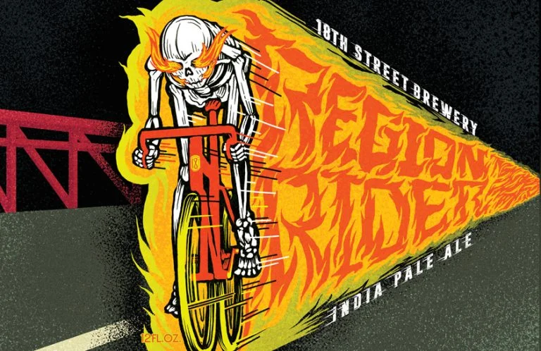
Gary, Indiana is known forever for its mention in the hit musical, The Music Man, but today it's mostly a symbol of urban blight. But there is a bright spot not far from the shambled downtown. Its 18th Street Brewing. And its beer has gained a following, and so has its artistic labels.
As soon as I saw their Moon Walk IPA label featuring an Apollo moon walker and the lunar module, I had to know more. “Moonwalk is one small sip for man, one giant leap for Gary, Ind.,” the label reads. Joey Potts, a graphic artist, has been doing the artwork for the brewery for nearly four years. When you see the labels you can tell he apparently likes sci-fi, and spoofs of Grateful Dead and Close Encounters of the Third Kind.
“I am given quite a bit of freedom with the labels, so I am able to interject much of my own personal interest/influence into each one, Potts said. “I also try to use unique and bold color combinations in the illustrations. “
How much a difference does the art pay in selling beer and building a brand? “A ton,” Potts said. “There are numerous craft breweries opening- and each is trying to sell their product. The art is typically the first introduction of the brewery to the consumer, so you want that to be memorable.”

